Once you and your evaluation team have identified key audiences with whom you can share the evaluation findings, next steps include:
There are many types of reporting styles and approaches that you and your evaluation partners can use to share your evaluation findings. Ultimately, they depend on your audience. The following section will describe five common types of evaluation reports.
Traditional reports tend to be formal and comprehensive in nature and should follow the standard format of reporting in your agency. The document provides a detailed summary of the evaluation goals and objectives, methodology, and findings, and is illustrated with facts and figures to showcase the data. Oftentimes these reports are used to reference the historical context, disseminate information across the agency, and add knowledge to reporting systems and future intervention efforts. Although these reports are valuable to an organization for the reasons listed above, it can take a lot of effort and resources to complete the report, which can be costly.
An executive summary is an abbreviated version of a traditional report, meaning it typically summarizes the same sections found in the comprehensive report. Often, executive summaries are written after the full report is completed and excerpts are copied and pasted to create the condensed report.
Issue briefs and facts sheets are short, written documents that state the issue at hand, outline recommended action steps, and provide supplemental information to support findings and recommendations. Issue briefs are usually one to two pages and include a list of references and contact information for the author. Issue briefs and fact sheets can be useful when trying to enlist support from elected officials or other decision-makers.
Often, you will have a specific audience including upper-level leadership that is interested in the results of your evaluation. Because traditional reports can be overwhelming to read and upper management will not have time to digest all of the information in a dense report, you will need to translate your written evaluation report into a short and concise presentation. Remember, all of the information in the report is relevant, however, the purpose of the presentation is to showcase the high-level issues, actions, findings, and recommendations for next steps.
Posting evaluation findings on a credible website is an excellent way of communicating information to a large audience. You can upload all reports online and create interactive visuals to display data. Potential postings include:
A data dashboard is an online tool that is used for visualizing real-time or archived data to external or internal partners. The goal of the data dashboard is to create an interactive interface where the user can create customized data reports to meet their specific needs.
Data visualization is a technique that is used to enhance the quality of evaluation reports and communicates data/information using engaging images that resonate with the audience. It is important to display your data and complement your text with visual and graphic depictions of your findings. This section of the guide provides you with examples of how to display evaluation findings using the different data visualization techniques such as:
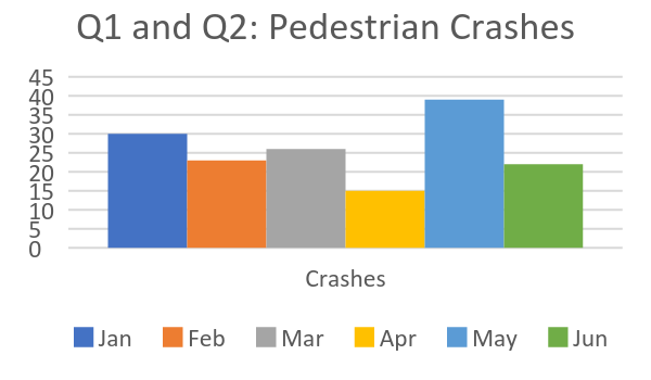
Shows frequency by category visually instead of using numbers; bar charts are great for comparing the relative frequency of different categories

Shows relative frequency by category visually instead of using numbers; pie charts are great for showing importance of each category relative to the whole

A bar chart for grouped numerical data in which the frequencies or percentages if each group are representative as individual vertical bars; histograms are great for showing multiple variables on one chart
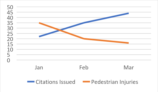
Line graphs are used often to show trends over time.
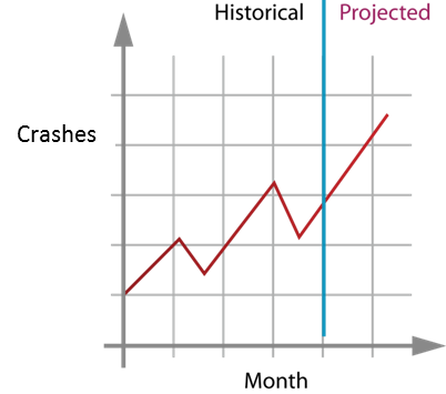
Also for two variables, but the horizontal variable must be a measurement of time. Time series graphics and analyses are great for illustrating historical trends and predicting future values and trends over time.
Shows the actual data as individual (ungrouped) data points for two variables. Scatter plots are used in analysis to draw the best fit line and to show detail of data distribution, spread, and trend.

In an evaluation, it is always a good idea to show comparison data to demonstrate change before and after the intervention was implemented. It is also helpful for presenting differences between two variables.
Comparisons over time can be represented using an interrupted time series graph. In these graphs, data can be trended and compared to illustrate changes that have occurred in a population over multiple months or years after an intervention takes place (e.g., after a policy is adopted).
There are a number of ways to show comparison data. All you have to do is select a data visualization method of your choice and put old and new data side by side to compare.

Since qualitative data focus on themes and categories rather than numbers, graphs, tables, and charts are not a good method to display this type of data. Instead, use the following:
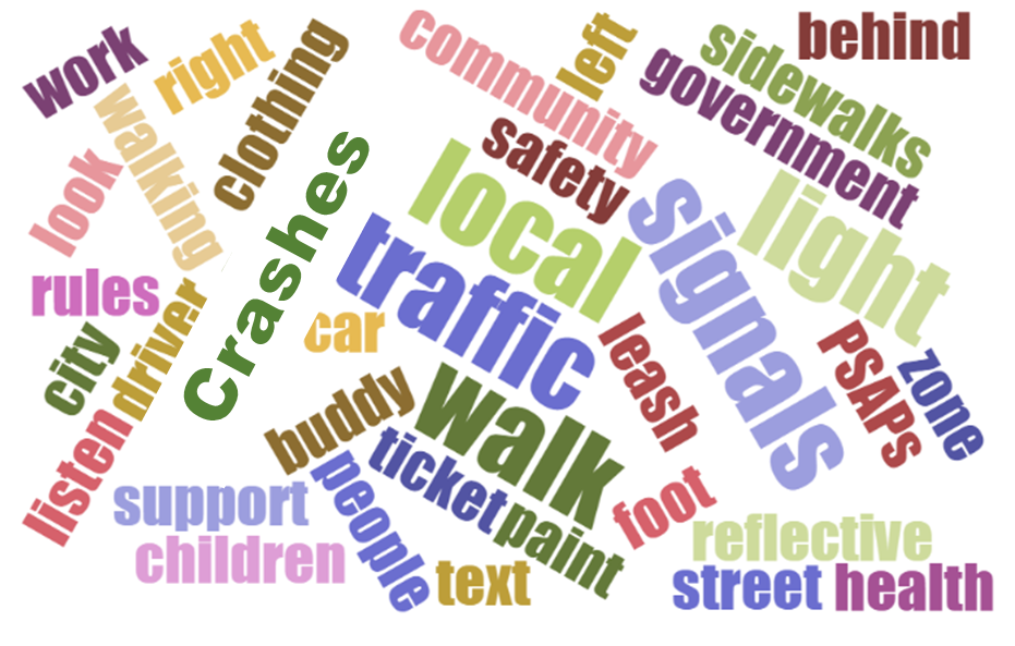
Infographics are a visual representation of information, data, or knowledge displayed in an easy-to-read format. Infographic presents vital information in an attractive and digestible design to educate the reader on the evaluation findings.

NY PSAP- Vision Zero: Year Three Report
Given that evaluation is about improvement, creating recommended next steps is often an important way to start using evaluation findings. Framing is an important consideration in considering audiences for dissemination. Individuals can interpret the same data in different ways depending on the mental model through which they perceive information. It is often good practice to first share preliminary evaluation findings and a draft version of recommendations with program implementers and partners to ensure that the findings are presented in the proper context and recommendations are infused with their valuable feedback. Engaging evaluation partners in the framing of evaluation findings and development of recommendations: increases the credibility of the evaluation findings; ensures recommendations are feasible and realistic to implement; and enhances buy-in and likelihood that recommendations will be implemented.


 Section 1: Evaluation Purpose and Partners
 Section 2: Describing the Intervention
 Section 3:
  Section 4: Methodology and Data Collection
 Section 5:
  Section 6: Reporting and Dissemination